Making Venngage icons more customizable
where
Venngage,
2020
2020
what
Product Designer
Product Owner
Researcher
Product Owner
Researcher
how
Sketch
Invision
Illustrator
Invision
Illustrator
As part of our self-serve templates editing, Venngage customers often use icons and illustrations in their designs. Even though over the years efforts were made to ensure a diverse icon library, the majority of people icons were still light skinned, and it did not solve the full problem for our diverse customers.
Our users wanted to find examples of diverse representation in icons for specific professions or hobbies, rather than having to use the same token icons to represent diversity in their designs.
"Please can we have people of colour for the hikers...
"I'd like access to icons with people of color, I'd like to ask that you please add more diversity to the icons available for use, including icons of female doctors. Thank you.
In October 2020 we delivered the first part of the project, which allowed users to customize the skin tone, based on the 5 skin tones of the Fitzpatrick scale.
Using the Shape Up method (Basecamp), and working closely with engineers, I began considering possible solutions, rabbit holes and dependencies with the goal of completing the implementation within a three-week appetite.

As part of shaping, I conducted market analysis in the design software space and researched the history of representation in iconography. Through this process I learned a lot about the politics of emoji use in messaging apps and behavioural economics behind icon customization. Next, I started narrowing down on a few potential approaches to this problem.

I knew that purchasing more diverse icon libraries would only be a band-aid solution. Instead, we needed to empower our users with the right tools to make their designs representative, without having to compromise on design quality or complexity.
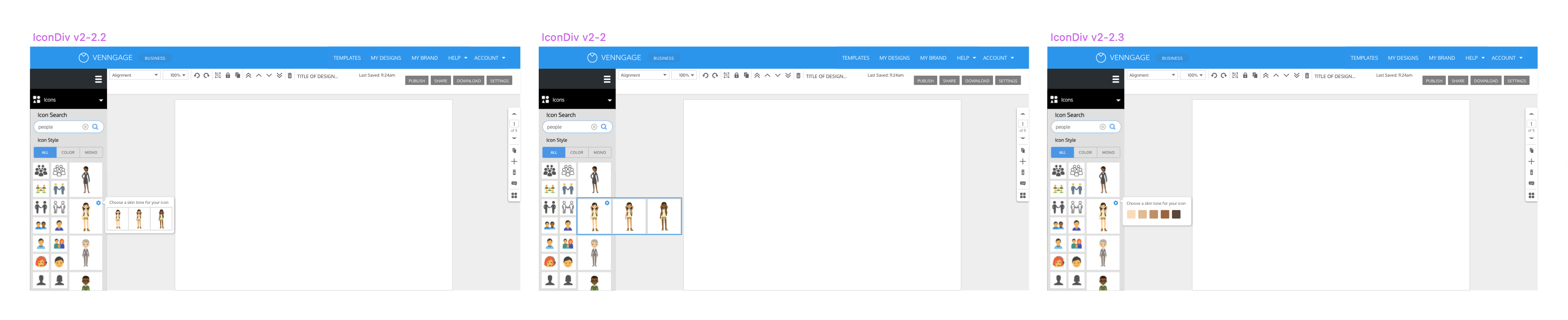
I decided to allow our users to customize the skin tone and hair style and colour of the people icons. It is a behaviour many are familiar with from the messaging and social media apps, and something they expected to be able to do in Venngage. While exploring the possible solution, I identified a number of quick fixes that required no dev work.
Meanwhile, I identified some quick fixes that could be done immediately and didn't require any engineering resource. These included updated the order the icons appear in search results and updating the search tags to improve the accuracy of the results. This ensured that our users would see the diverse icons we already had. After these fixes, we saw a 5-10% increase in conversion rates across 5 out of 6 key searches.
.png)
I started sketching out the vision and discussing with the engineers what the implementation could look like. As we dug deeper, we discovered a number of dependencies.
Firstly, the design of our existing icons was fairly complex, which meant changing the skin tone was not as simple as changing one hex code. We also had to account for small elements: nose, neck shadows, eyebrows - all of these had to be updated for each skin tone.


Secondly, in the past we acquired icons from different icon libraries , which meant that the skin tones (hex codes) of existing diverse icons were not standardized. This was a significant hurdle for scalability.

Other dependencies included:
Through ongoing discussions with the engineers, we realized that their proposed approach was fairly high risk, since we were making assumptions about the SVG structure and script that we were not able to test ahead of time; it required a lot of manual work from the Product Owner (providing the hex codes, icon IDs, manually checking output for quality control); it was limited to very specific icons and not scalable.
I chose to go with the alternative version, which involved hiring a contractor to create the skin tone versions of the icons in Adobe Illustrator for the first part of the implementation. This solution only saved us 1-2 weeks in developer time and still involved a significant amount of manual intervention from the Product Owner, but we felt a lot more confident about the outcome. What’s more, it allowed us to cover a lot more icons since we were not constrained by the technical requirements.
While deliberating the best approach for the backend implementation, I turned my attention to the user facing side of the feature. I considered a number of different options and presented it to the Product Design team for review.
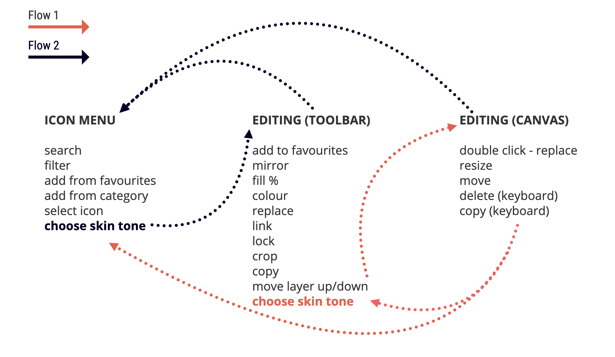

Some of the considerations that guided my sketches:
After a number of iterations, I settled on the flow below. The UI elements were finalized during the Building phase.

In preparation for the engineering part of the implementation, I engaged and trained a contractor to create the alternative icons in Adobe Illustrator. Together with our in-house Graphic Designer, we monitored the quality control of the icons, iterating and making adjustments where necessary.

At the start of the building, together with the Design Manager, we decided to increase scope both in number of icons and number of skin tones we were adding. We felt that while three skin tones would be an improvement on the current state, we were able to deliver a better feature to our users in the space time. I worked together with the engineering lead, QA and graphic designers to ensure we were still able to deliver the project on time and quality, and that everyone was aligned on our goal.
In October 2020 we delivered the first part of the project, which allowed users to customize the skin tone, based on the 5 skin tones of the Fitzpatrick scale.
The customers that had previously requested the feature were happy with the results:
"Thanks so very much for both making these improvements and letting me know so quickly. I'm extremely excited to check out this new feature!
Looking at the key metrics a couple of weeks after the release, we saw that ~30% of users that chose one of the customizable icons ended up engaging with the feature and changing the skin tone.
Internally, the feature was well received and our marketing team was keen to promote it to the users. This resulted in a number of social posts and blog articles encouraging users to design for diversity.