Design system for a rapidly scaling startup
where
FutureFit AI,
2021-22
2021-22
what
UX Design
UI Design
Design System
UI Design
Design System
how
Figma
Miro
Storybook
Miro
Storybook
I joined FutureFit AI (FFAI) in November 2021 as their first in-house designer to work directly with the Head of Product on a complete redesign of the platform.
FFAI is an AI-powered platform for those that are being let go or moved to a different department and require a new set of skills. They partner with businesses and public sector organisations to aid their workers in an end-to-end career transition journey. As they were gearing up for their next investment round, urgent design expertise was critical - both in terms of a rebrand as well as a thought-out user experience.
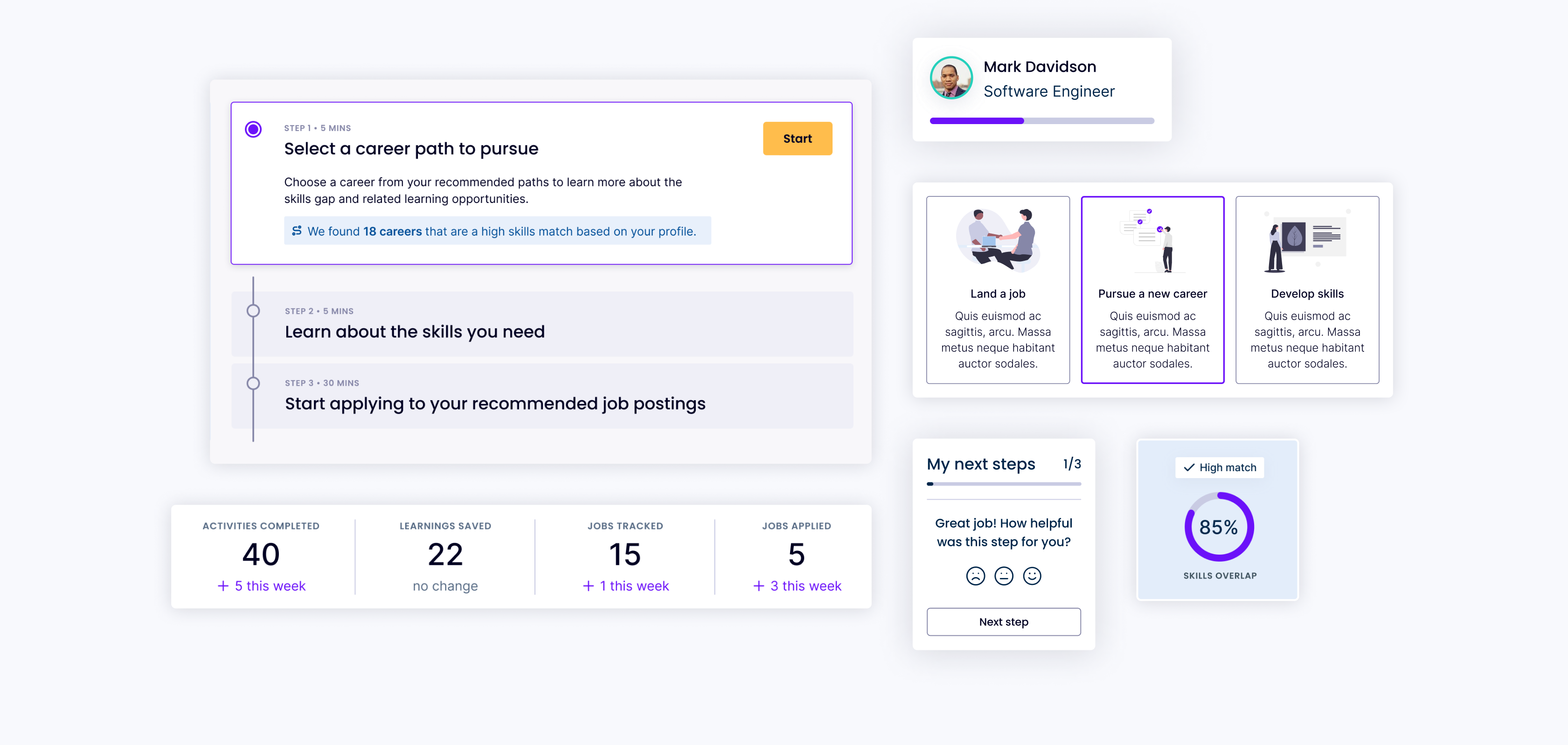
One of the key tasks was setting up and managing a new Design System.
-p-2000.png)
Working as a solo designer meant I had limited time to spend developing the Design System alongside other rapid UX work. The Design System had to scale fast, as I was discovering new use cases and constantly rethinking and expanding the library, so I had to approach this challenge strategically.
Working with Head of Product and Front-End Engineers, I established a set of short term and long term priorities. Rapid scalability and modularity were some of the guiding principles, working towards a tight deadline for the launch of the MVP. In practice this often meant favouring reusable components and a templated approach to layouts, where possible.

Working with the Head of Product, we ensured that user research was baked into the Design System and organised a number of prototype usability studies, as well as other discovery exercises. These helped drive the development of the component library and interaction patterns.
Another consideration was designing with real data in mind. During low fidelity wireframing, lorem ipsum is my go-to, but when it comes to finalising components and screens, I try to insert real data values where possible. This minimises the risk of running into difficult “what if” roadblocks at a later date:
Using data instead of placeholders allowed me to address these real world scenarios in the designs early on.
One of the first tasks was deciding on the typography and the colour palette. I presented a few options to the Leadership team, aiming to encapsulate a modern, vibrant brand while also taking into account the delicate state of mind of the end user. The job seeking process can be extremely emotional, especially after being laid off; this was a key consideration in my design approach - from colour palette to UX micro copy. It was important for the platform voice to be that of helpful guidance and coaching, rather than adding more pressure on the already stressed users.
I proceeded to set up the foundations with a series of page templates. Following the dashboard UX best practices, I explored a few approaches to information architecture, navigation and sidebar options. Working with the front-end engineers, we defined the grid for key breakpoints, based on their setup in Tailwind CSS.

The next step was getting started on an ever-developing set of components, guided by the Atomic Design approach. Continuously working with developers, we made sure that naming conventions and component organisation work for both sides: the Design System was mirrored in Storybook and a collaborative approach made the process more streamlined.

Having the opportunity to build a Design System from scratch meant that accessibility became part of the process, rather than an afterthought.
Some of the key principles taken into account were:
There is definitely room for improvements, as trade offs have to be made and time to ensure all standards are met is limited, but it sets us up on the right path and ensures that adherence to accessibility standards is a shared mission.
.png)
Pragmatic creativity is a concept I borrowed from BBC’s Design System; it resonates well with my approach to working on the Design System. When iterating on some of the more complex screens, I occasionally had to step away from the established set of rules in order to think creatively. This could mean both adding new components, as well as re-evaluating certain existing patterns. It was important to be pragmatic about when to be flexible and add a splash of something new to the system.
.png)
A set of components is not enough to maintain a successful Design System; there needs to be enough context to make it accessible for a range of internal users. I aimed where possible to:
While we had weekly grooming meetings with the Head of Product and the developers, there was not enough time to discuss all the interaction details. In a fully remote team, asynchronous communication is key. I wanted to provide the necessary context around designs, without creating yet another document that people dread.
Therefore, my handovers consisted of contextual notes in Figma files, video walkthroughs of specific interactions or more complex flows, visualisations of expected behaviours in static files. Furthermore, when new components were added to the library, I linked the screens to the set of components so developers always have access to the source of truth.


In under two months since starting the role, I completed the redesign of the tool in time for the MVP launch. The Design System played a key role in ensuring a successful launch: